According to wikipedia.org, this is what Intellectual Property Rights are.
" Legal concept which refers to creations of the mind for which exclusive rights are recognised. Under intellectual property law, owners are granted certain exclusive rights to a variety of intangible assets, such as musical, literary and artistic works; discoveries and inventions: and words, phrases, symbols and designs. Common types of intellectual property rights include copyright, trademarks, patents, industrial design rights and some jurisdictions trade secrets."
Before you fully understand what Intellectual Property Rights are,you have to know what trademarks, industrial design rights, patents and trade secrets are, so in these next few posts I will talk about them.
-Rebecca Hickey
Wednesday 29 May 2013
Copyright.
According to About.com this is the definition of Copyright.
"Copyright refers to laws that regulate the use of the work of a creator, such as an artist or author. This includes copying, distributing, altering and displaying creative literary and other types of work. Unless otherwise stated in the contract, the author or creator of a work retains the copyright.
For a copyright to apply to a work, it must be an original idea that is put to use. The idea alone cannot be protected by copyright. It is the physical use of that idea, such as an illustration or a written novel, that is covered under copyright law."
Basically, copyright protects others from using something that you've produced and from gaining profit or credit for it. Once your creation is under copyright, you and you alone can use it unless you state in your contract that you have given another person permission to use it.
The only thing that the copyright does not stop people from doing is using the general idea of your creation. For example, you've written a novel and in that novel one of your character's says "Oh my jellybeans that is one big fish!" and you describe that they're wearing a red hat and a yellow raincoat. Some time after you publish your novel, a film comes out with a scene that is similar to a part of your book, in the film one of the main characters is wearing a yellow hat and a red raincoat and is saying "Oh my jellyfish, that's a Godzilla of a creature there Phil!" Even though the person that wrote the film may have read your novel and ripped off the idea and made a scene from it, you cannot claim any profit that the film will have made because it is nothing like the part in your novel even if it is similar to it.
Sometimes people can get confused and mistake something that someone has made as an alteration of what you have produced. In some cases the person will have copied someones work and changed one thing to try and get away with it, but in some cases an artist or creator may have been influenced by your work and decided to do it in the style that you have worked in.
It can get complicated when something like this happens, but if you are careful and do not use parts of other peoples work then nothing bad will happen.
Now I know what you're thinking... Copyright is confusing, but it really isn't. If you're careful you won't get into any legal troubles. If you do want to use something that isn't yours then state who it is by, where you found it to show evidence that you own to rights to whatever you're using. If you cannot find any information about what you want to show, then ask someone if they who or can find out who it is by. Doing this will help the person that owns the copyright out and give them the credit that they deserve, because after all, everybody hates a copycat.
-Rebecca Hickey
The Legal and Ethical constraints of social media and website design.
There are many things that you have to think about in order to make a website free of anything that could be considered illegal. Some of the things that you should be looking at is copyright, intellectual property rights, permissions, sensitivity to groups of society, explicit content and safeguarding. All of these things must be checked before and during the process of creating a website.
To understand what these things are, they must be researched and quite a bit. I shall be making posts that discuss each of these things and how you can use them to prevent anything bad happening from what you put on a website.
-Rebecca Hickey
To understand what these things are, they must be researched and quite a bit. I shall be making posts that discuss each of these things and how you can use them to prevent anything bad happening from what you put on a website.
-Rebecca Hickey
Tuesday 28 May 2013
Three good websites. (Number Three.)
To conclude the posts on good websites, I give you this last one to look at.
This is the website for the American fashion designer Marc Ecko.
(http://www.marcecko.com/#/?query=08c77e3874039c55254ad8118086b967)
As well as using this website to support his designs, he also uses it to promote the many causes that he likes to help out.
I have chosen to post about this website last because I felt that it was the most important out of the three that I have researched. This website not only gives the viewer what they want, it also gives them information about other things that they may be interested in.
Seeing as the person who the website is about has taken such an interest into updating it frequently with things that he cares about, I think that with this personal feel, it will attract more people to view his designs which is a very clever strategy.
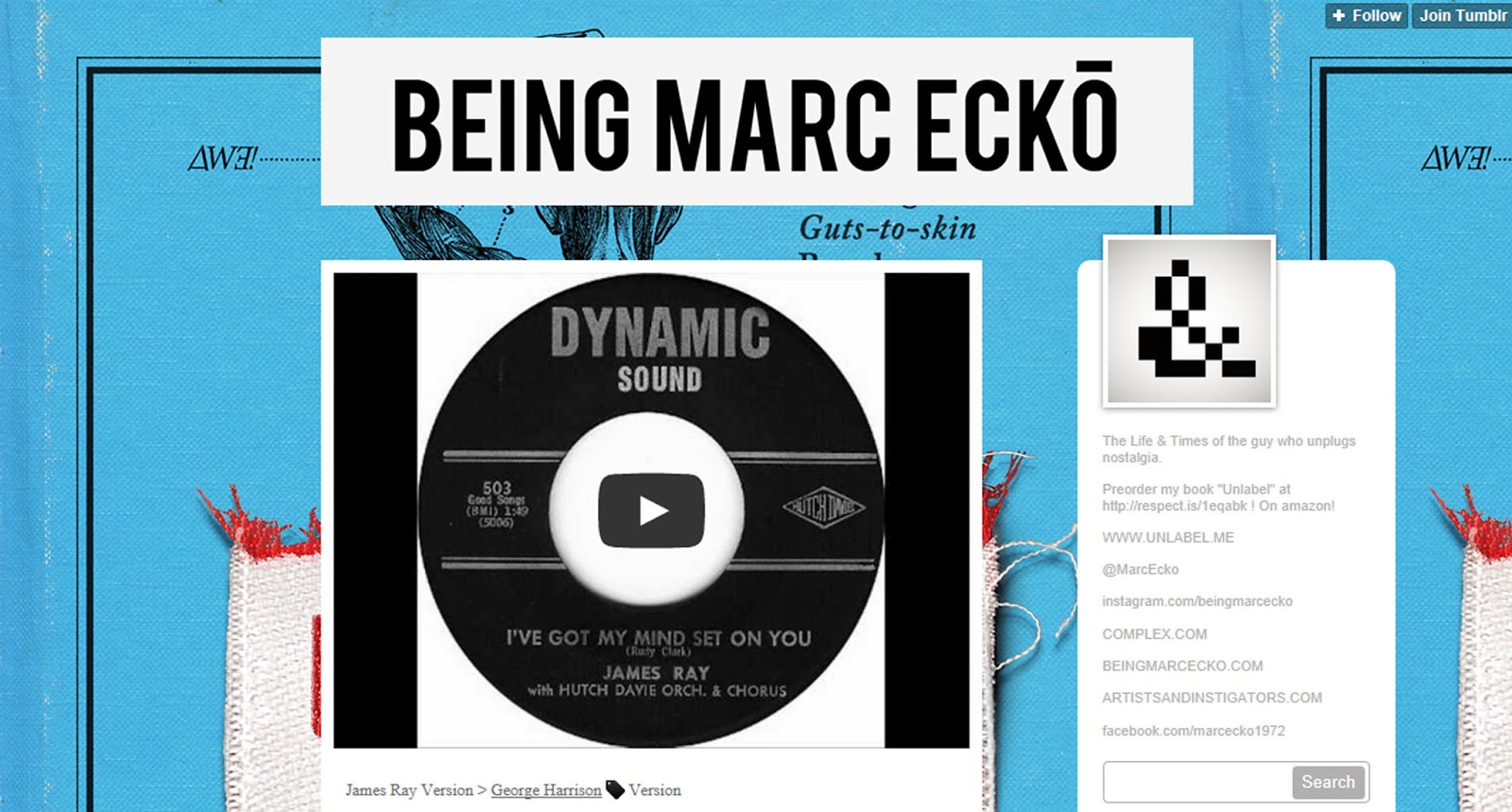
Here is an image of the homepage for Marc Ecko. As you can see, there aren't many colours used which makes a change from most homepages. You can see mostly black & white with the occasional red, yellow or gold.

As soon as you go onto the website, this is what should show up. The idea for the page is that when you move your mouse, the homepage also moves with it to different sections of that page. This gives you a choice of how you want to navigate.
When you move your mouse to the center of the page, this is what it looks like.

As you can see, the links to the different pages and sections of the website have been displayed as images hanging on a wall, surrounding a small image of the designer. I think that this makes the website more interactive, which will not bore the viewing audience.
The funny thing about this website is that at the bottom of the page, the copyright logo says, "2008 Marc Ecko Enterprises". The website's theme has not been updated since 2008, that's 5 years! It must be doing well if it hasn't changed its theme in years.
If you go to the left of the page, you will notice that there are two frames with links to a Facebook page & a blog.

Of course this is normal for a website to contain links of other things in relation, but you don't always see a blog. This can also be a good factor for gaining for viewers and customers.
The link to the blog just so happens to be a Tumblr account. (How very original Marc.)

I think that by having the blog as a Tumblr will attract a younger audience and maybe strike the curiosity of an older audience because of the content that it will show.
When you start to move your mouse around the page, you notice the many images of things surrounding the Marc Ecko logo. If you look at them clearly, some of the titles do not really fit in with fashion, but if you view some of these sections, you will see that fashion does in fact link to these subjects. Fashion can be used to express, promote, or make a statement of a person's opinions and feelings which is how this website is different from the others. The designer, uses his designs & website to his advantage which helps a lot of people.
This, is also one of the reasons why I thought this website was brilliant. It uses the idea of fashion and expands it, which is basically the role of a website anyways, to expand your idea.
For people that do not have time to navigate the website using just the mouse and images, there is also a type of drop-box that lists all of the websites content. If you hover your mouse to the top if the page, it should show up.
This, is what it looks like.

Instead of having a gallery like most fashion based websites, in one of the sections, there is a hyperlink to the Marc Ecko clothing page where you can buy and browse his different styles and creations. I found that his clothing page, was one of the best that I have seen because it is very easy to find everything that you want.
I think that overall, this website looks clean and it is fun and easy to use. It is probably aimed at a younger generation, but it may be aimed at others because of the non-fashion based content. The layout it very original and the colours that have been used do not clash, which is a good point. I think that this website is very modern with a hint of warmth and welcoming which is great as a USP. This is probably one of the most appealing websites that I have been on and I don't see why others won't like it. If I was to number this website out of 10, It would definitely get a 9.5. (It gets a 0.5 off for all the links)
-Rebecca Hickey
This is the website for the American fashion designer Marc Ecko.
(http://www.marcecko.com/#/?query=08c77e3874039c55254ad8118086b967)
As well as using this website to support his designs, he also uses it to promote the many causes that he likes to help out.
I have chosen to post about this website last because I felt that it was the most important out of the three that I have researched. This website not only gives the viewer what they want, it also gives them information about other things that they may be interested in.
Seeing as the person who the website is about has taken such an interest into updating it frequently with things that he cares about, I think that with this personal feel, it will attract more people to view his designs which is a very clever strategy.
Here is an image of the homepage for Marc Ecko. As you can see, there aren't many colours used which makes a change from most homepages. You can see mostly black & white with the occasional red, yellow or gold.

As soon as you go onto the website, this is what should show up. The idea for the page is that when you move your mouse, the homepage also moves with it to different sections of that page. This gives you a choice of how you want to navigate.
When you move your mouse to the center of the page, this is what it looks like.

As you can see, the links to the different pages and sections of the website have been displayed as images hanging on a wall, surrounding a small image of the designer. I think that this makes the website more interactive, which will not bore the viewing audience.
The funny thing about this website is that at the bottom of the page, the copyright logo says, "2008 Marc Ecko Enterprises". The website's theme has not been updated since 2008, that's 5 years! It must be doing well if it hasn't changed its theme in years.
If you go to the left of the page, you will notice that there are two frames with links to a Facebook page & a blog.

Of course this is normal for a website to contain links of other things in relation, but you don't always see a blog. This can also be a good factor for gaining for viewers and customers.
The link to the blog just so happens to be a Tumblr account. (How very original Marc.)
I think that by having the blog as a Tumblr will attract a younger audience and maybe strike the curiosity of an older audience because of the content that it will show.
When you start to move your mouse around the page, you notice the many images of things surrounding the Marc Ecko logo. If you look at them clearly, some of the titles do not really fit in with fashion, but if you view some of these sections, you will see that fashion does in fact link to these subjects. Fashion can be used to express, promote, or make a statement of a person's opinions and feelings which is how this website is different from the others. The designer, uses his designs & website to his advantage which helps a lot of people.
This, is also one of the reasons why I thought this website was brilliant. It uses the idea of fashion and expands it, which is basically the role of a website anyways, to expand your idea.
For people that do not have time to navigate the website using just the mouse and images, there is also a type of drop-box that lists all of the websites content. If you hover your mouse to the top if the page, it should show up.
This, is what it looks like.

Instead of having a gallery like most fashion based websites, in one of the sections, there is a hyperlink to the Marc Ecko clothing page where you can buy and browse his different styles and creations. I found that his clothing page, was one of the best that I have seen because it is very easy to find everything that you want.
I think that overall, this website looks clean and it is fun and easy to use. It is probably aimed at a younger generation, but it may be aimed at others because of the non-fashion based content. The layout it very original and the colours that have been used do not clash, which is a good point. I think that this website is very modern with a hint of warmth and welcoming which is great as a USP. This is probably one of the most appealing websites that I have been on and I don't see why others won't like it. If I was to number this website out of 10, It would definitely get a 9.5. (It gets a 0.5 off for all the links)
-Rebecca Hickey
Tuesday 21 May 2013
Research.
Last week, my tutor told the class that we each had to get one book out of the college library that we thought would help us with the research for our website. At first I thought, "I am really not going to find anything about what I want to do..." but I was wrong. I found the perfect book. "The Guinness Guide To 20th Century Fashion" has actually been really helpful and useful. I would never have had the idea for the theme of my website if I hadn't read it. Each page of the book describes in detail what people wore in each decade of the 20th century and how things have changed from the start. This book has really helped me and has strangely been very interesting. I think that I will use books more often in the future to gather information because I think that there are things in books that you just cannot find on the internet.
-Rebecca Hickey
-Rebecca Hickey
The different pages of my website.
The draft designs that I have been working on gave me lots of ideas of how I want my website to look. Through messing around with different ideas, I have been able to finish the design for my pages. These are the examples of what I want it to look like.
Website Open Site Page:

Homepage:

Icon Page:

Hairstyles Page:

Clothes Page:
Jewellery Page:

Gallery Page:

The reason that I have used these colours, pattern designs and font is because it is very art deco. Art Deco is something that has never gone out of fashion and is something that has influenced many people. I thought that if I made my website in this style, it would attract people to view it.
As you can see, I haven't put any information or images on any these design pages. I haven't done this yet because I am still in the process of writing all of my information down and getting my images to the standard that I want; because I want some of my own drawings to be in the gallery, I won't have any of my content mocked up for a some time.
-Rebecca Hickey
Website Open Site Page:

Homepage:

Icon Page:

Hairstyles Page:

Clothes Page:

Jewellery Page:

Gallery Page:

The reason that I have used these colours, pattern designs and font is because it is very art deco. Art Deco is something that has never gone out of fashion and is something that has influenced many people. I thought that if I made my website in this style, it would attract people to view it.
As you can see, I haven't put any information or images on any these design pages. I haven't done this yet because I am still in the process of writing all of my information down and getting my images to the standard that I want; because I want some of my own drawings to be in the gallery, I won't have any of my content mocked up for a some time.
-Rebecca Hickey
Website pattern.
On all of my pages, I have made sure that the theme is the same because I do not want any of them to clash or look really tacky. Plus simple is nearly always effective.
Every page has this handkerchief design on it.

I went onto google and typed in 20th century handkerchief designs and a design quite similar to this showed up. I then worked from the other design in Adobe Illustrator and came up with this. I made sure that it was really plain so I could change it anyway that I wanted for my page designs. I have been influenced by this design a lot and that is why I chose for it to be on every page. I think that's an example of simple beauty, which is what most popular fashion trends are.
-Rebecca Hickey
Monday 20 May 2013
My Website Hompage.

So this is a draft design of how I would like the homepage to my website to look like.
I have made sure that I have stuck to the theme of the content that I want to include.
I made the design black & white because I think that it is simple but effective and it kind of gives the design a classic look.
I used the handkerchief design again, but turned it black because I thought that it looked a little better.
-Rebecca Hickey
My Website Name.
I have decided to call my website Popular Trends. Seeing has it hasn't already been used before, my website URL will be populartrends.com. I think that this is the perfect name for my website because that's exactly what I'm going to be talking about, popular trends & styles within fashion throughout the years.
-Rebecca Hickey
-Rebecca Hickey
Some examples of what I will include in my website...
When I was doing research for my website, it occurred to me that I hadn't even thought of any celebrities/actors who's style I was going to talk about. After talking about it with my friend Saskia, she gave me a list of her favourite fashion icons within the film industry.
This is the list, and links that she sent to me.
http://i.imgur.com/z1RhVsZ.jpg Liz Taylor
http://i.imgur.com/2jRLtGb.jpg Judy Garland
http://i.imgur.com/Yqaye.jpg Grace Kelly
http://2.bp.blogspot.com/-NL3EouiLUkw/UU2uwMltPwI/AAAAAAAAUTU/RFOSftbIqzM/s1600/tumblr_mhfm3yPRuG1qh0yodo1_1280.jpg Raquel Welch
http://2.bp.blogspot.com/-Em-TwV-F2Lo/UOy7eSEwOzI/AAAAAAAAJlo/rFZS9suhfzo/s1600/atuesdayweld.jpg Tuesday Weld
http://i.imgur.com/PT0KcRL.jpg Jazzy Maz
http://i.imgur.com/BUSNNb9.jpg Bridget Bardot
http://i.imgur.com/BBFgE8O.jpg Mary Tyler Moore
http://i.imgur.com/Oy0zS.jpg Viviene Leigh
http://www.jsrpages.co.uk/scansw/woodn/Natalie%20Wood076.jpg Natalie Wood
http://2.bp.blogspot.com/-AmBDq1K3ER8/UL4BHDz9t-I/AAAAAAAAEu8/VqUJ6qtkMuk/s1600/Jane_Seymour+%2843%29.jpg Jane Seymour
http://i.imgur.com/DErgp.jpg Fay Wray
http://25.media.tumblr.com/tumblr_m723iw3GnP1r1r7rjo1_1280.jpg Neile Adams
http://i.imgur.com/wvaRD.jpg Marlene Dietrich
http://i.imgur.com/h9xJobZ.png Sophia Loren (with added cat)
http://i.imgur.com/1juXm.jpg Rita Hayworth
http://i.imgur.com/Py8RfnP.jpg?1 Mia Farrow
http://i.imgur.com/CkhhX.jpg Ava gardner
http://i.imgur.com/55hoE.jpg Ella Raines
http://1.bp.blogspot.com/_9Izdq8bedtQ/TIK8e-PZPCI/AAAAAAAAayI/heiCZ-O8P-I/s1600/anne-baxter-wallpaper_1251_17091.jpg Anne Baxter
http://i.imgur.com/3DFAJ6n.jpg Ann Sheridan
http://i.imgur.com/wEoSezD.jpg Clara Bow
http://i.imgur.com/d7BRudE.jpg Rosemary Clooney (Georges aunty)
http://i.imgur.com/aZsQA6z.jpg Samia Gamal, Egyptian Bellydancer
http://i.imgur.com/DiNug.jpg Lauren Bacall
http://i.imgur.com/DFtz3.jpg Dorothy Lamour
http://i.imgur.com/wNVPY.jpg Lana Turner
http://i.imgur.com/YEXlub9.jpg Heather Angel
http://i.imgur.com/yuqUKYl.jpg http://i.imgur.com/6fo6V4P.jpg Stella Stevens
http://i.imgur.com/6fo6V4P.jpg Carol Lynley
http://i.imgur.com/1FkdF4u.jpg Diana Dors
http://i.imgur.com/3pazBjS.jpg Ginger Rogers
http://i.imgur.com/OPO4Pfd.jpg Cyd Charisse
I think that these are some perfect examples of what I want to show and talk about in my website. I have decided that I will take some of these women and talk about fashion styles, where they came from and what they influenced.
-Rebecca Hickey
Design for open site page.
Today in one of my lessons, I started to play around with ideas of what I wanted the design for my open site page to look like.
I decided that this looked really nice.

I thought that this design was good because it is really simple and doesn't use that much colour. I used a simple flower design that could have been used on a handkerchief in the early 20th century, I thought the font looked quite old fashioned too.
I think that I will used this design as an open page for my website because it relates to what I want it to be about.
When you type in the URL of my website into the address bar, this is the first thing that will show up and you can decide whether you want to enter the site or not.
-Rebecca Hickey
Sunday 19 May 2013
Sketches.
Today, I decided to do some rough sketches of the fashion styles that I was thinking about adding to my website, when they are finished I should be posting them on here.
-Rebecca Hickey
-Rebecca Hickey
Wednesday 15 May 2013
The 2000's.
http://pinterest.com/rbecah23/the-2000s/
The 2000's weren't really any different than any other year except from young people wearing more and more controversial clothing.
-Rebecca Hickey
-Rebecca Hickey
The 90's.
http://pinterest.com/rbecah23/the-90s/
The 90's made a massive breakthrough with science with Dolly the Sheep. The fact that they managed to clone a sheep from an adult cell is just amazing. Fashion had changed quite a bit and it had started to get more simple and more and more people started to wear polo shirts. (Even the women!) It was the decade for television shows more than anything and the music seemed to go into a more R 'N B, Pop, Rap kind of style. The 90's seemed to experiment with fashion more than anything with everyone adapting different styles instead of all just going with one.
-Rebecca Hickey
Tuesday 14 May 2013
Three good websites. (Number Two.)
Here is another fashion website that I thought was really good. It is the website for Tom Ford designs. (http://www.tomford.com/#/en)
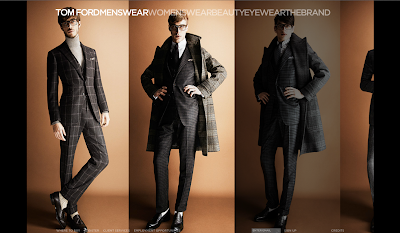
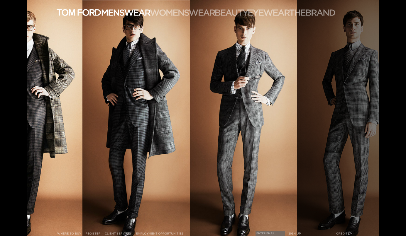
Here is the homepage.

The first image is of when you click on the website, the second is of when you actually enter it. The second image gives you an idea of what is actually in fashion at the moment and an example of what the designer creates.

At the top of the homepage, there are links to the different sections of the website. The fact the the name of the designer is in black and the rest of the text is in grey makes it stand out and helps you to remember who the designer is. I really like how there aren't any gaps between the different sections, so it looks like they are all one word.
.png)
As you can see, whoever made this website obviously took a leaf out of any fashion magazine's book as the headings of one of the links is slightly covered up by the top of the person's head that is in the image. I don't know why, but it kind of works in a weird way.
It makes the person in the image the main point of the page which what people clicked on the website to see, people wearing Tom Ford's designs.
When you hover over one of the sections, it gives you the option to see the different seasons of styles from this year and a couple of previous years to see how the designer has changed his style.
.png)
This is a strong aspect of the website because it gives the viewer a choice. They can see what is in style at the moment, or they can see what was in style the years before. This is also an example of what I was saying before, people love to look back to previous years, either to laugh, or to cry.
The colours that are being used are pretty simple, black, white, grey & brown. This gives the website a clean cut look because the colours go really well with each-other. Any other colour comes from the photo's that have been used on the website. I think that this helps to make the website good because it's simple but really effective which can be hard to do if you think about it too much.
Another thing that I noticed that makes this website great is that there isn't just a random photo gallery to show off the clothes and designs, the gallery is automatically moves from one picture to another when you hover over it, just like a showreel.

This happens for every for every section that you click on except the ones that hardly have anything on. The bad thing about doing this is that there is hardly any information about the designs, what they are called and how much they are.

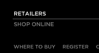
In the bottom left hand corner of the page, there is really small writing that says 'Where to buy'. When you click on this, it automatically directs you to a page that gives the choice of shopping online or finding a shop near you that sells the items that you want. Seeing as when you click on 'shop online' it only comes up with eyewear or make-up, I decided to click on the retailers option to see what was on offer. It turns out that when you click on that, you have to select different boxes before you are given an address for a shop in your area.


I would say that this is the weakest part of the whole website. People do not expect to go onto a fashion website and not be able to shop online properly. The fact that there is no information about anything that is on the website is very disappointing and I'm pretty sure that there's no update or else it would say it somewhere on it.
Even though this website lacks information, the layout, colours and use of images and the way they have been used is great. I think that it is a very modern and very beautiful website, which which works as a selling point for the products and designs of Tom Ford. Like I said in my 'What makes a good website?' post, " If a website doesn't look appealing, the audience is most likely not going to type it into their address bar." which is not the case here.
-Rebecca Hickey
Here is the homepage.


At the top of the homepage, there are links to the different sections of the website. The fact the the name of the designer is in black and the rest of the text is in grey makes it stand out and helps you to remember who the designer is. I really like how there aren't any gaps between the different sections, so it looks like they are all one word.
As you can see, whoever made this website obviously took a leaf out of any fashion magazine's book as the headings of one of the links is slightly covered up by the top of the person's head that is in the image. I don't know why, but it kind of works in a weird way.
It makes the person in the image the main point of the page which what people clicked on the website to see, people wearing Tom Ford's designs.
When you hover over one of the sections, it gives you the option to see the different seasons of styles from this year and a couple of previous years to see how the designer has changed his style.
.png)
This is a strong aspect of the website because it gives the viewer a choice. They can see what is in style at the moment, or they can see what was in style the years before. This is also an example of what I was saying before, people love to look back to previous years, either to laugh, or to cry.
The colours that are being used are pretty simple, black, white, grey & brown. This gives the website a clean cut look because the colours go really well with each-other. Any other colour comes from the photo's that have been used on the website. I think that this helps to make the website good because it's simple but really effective which can be hard to do if you think about it too much.
Another thing that I noticed that makes this website great is that there isn't just a random photo gallery to show off the clothes and designs, the gallery is automatically moves from one picture to another when you hover over it, just like a showreel.

This happens for every for every section that you click on except the ones that hardly have anything on. The bad thing about doing this is that there is hardly any information about the designs, what they are called and how much they are.

In the bottom left hand corner of the page, there is really small writing that says 'Where to buy'. When you click on this, it automatically directs you to a page that gives the choice of shopping online or finding a shop near you that sells the items that you want. Seeing as when you click on 'shop online' it only comes up with eyewear or make-up, I decided to click on the retailers option to see what was on offer. It turns out that when you click on that, you have to select different boxes before you are given an address for a shop in your area.


I would say that this is the weakest part of the whole website. People do not expect to go onto a fashion website and not be able to shop online properly. The fact that there is no information about anything that is on the website is very disappointing and I'm pretty sure that there's no update or else it would say it somewhere on it.
Even though this website lacks information, the layout, colours and use of images and the way they have been used is great. I think that it is a very modern and very beautiful website, which which works as a selling point for the products and designs of Tom Ford. Like I said in my 'What makes a good website?' post, " If a website doesn't look appealing, the audience is most likely not going to type it into their address bar." which is not the case here.
-Rebecca Hickey
Monday 13 May 2013
The 80's
http://pinterest.com/rbecah23/the-80s/
My personal opinion of the 80's is that it was a brilliant decade. There were some horrible fashion styles, (The New Romantic) but some really nice ones to. The 80's seemed more laid back and more about having fun then anything. Even though internet hadn't been invented yet, (that was ten years later) the personal computer had become available and gained a lot of attention. The 80's was a very influencial decade and things such as drum machines and synthesisers have been used in music that we listen to today. Films that were made in that decade have now become cult classics and the fashion has made people laugh or incorporate them into their style today. I think that that the 80's was one of the most important decades, not just for fashion, but for everything.
-Rebecca Hickey
The 70's.
http://pinterest.com/rbecah23/the-70s/
The 70's was a very colourful decade. It was the decade of classic rock and disco music and came out with some very important icons. Technology was growing and so was the film industry. However, 70's fashion hadn't changed that much from the previous decade which didn't matter that much because the next decade took a massive leap with that.
-Rebecca Hickey
The 60's.
http://pinterest.com/rbecah23/the-60s/
The 60's to me seemed to be the decade where things did and did not matter. People didn't care that much about if anyone was different, they were more aware that people should be treated equal, but at the same time people did care about equal rights and how they wanted peace for the world. Apart from that, the fashion from this time has certainly been used a lot in todays fashion styles and trends because they are seen as simple and pretty. I think that the reason that the styles of the 60's have been adapted into today's modern style is because they're really comfy and laid back which what people want these days.
-Rebecca Hickey
Three good websites. (Number One.)
On the checklist of things that we need to do in order to pass this project, it says that we have to compare and contrast three good websites and three bad websites, they all have to relate loosely to what theme we've picked for our website. I decided to compare and contrast different fashion websites, with the first one being the website for the design company Hermès. (http://uk.hermes.com/?combination=3)
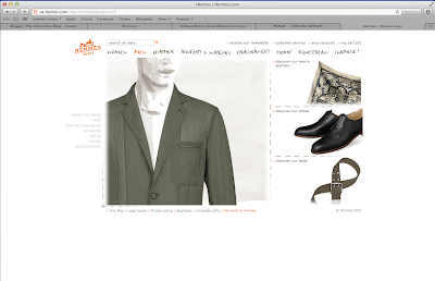
Here is the homepage for Hermès.
 I think that the homepage for this website is really good, the colours work well with each other and it has been laid out really well. The only thing that I would say that could be changed is the blank space around it. I feel that the contents on this page should be enlarged so it replaces all the white space.
However, this is quite a good technique to use as everything that you need to look at is right in front of you and you don't really need to look far for it. I guess that it just depends on the viewer really and what they prefer.
Another thing that I like about this homepage is the font that is used and the original images, they give the website a homely feeling and I automatically felt like I'd be able to find anything on the website which takes away the fact that there is a lot of white used.
When I clicked onto the different sections that are listed at the top of the website, I noticed that when I clicked onto the different pages, they were kind of exactly the same.


 There wasn't really anything different on them, (except from the words and images of course) the layout on each page was the same and there was still that blank outline. (Which is kind of annoying.)
Now, my personal opinion is that it gives the website a weak point, but it could be argued that it's also a strong quality as it gives the viewer everything that they need (again) right in front of them.
The thing that I noticed that was really clever is how the website shows the different types of clothing that can be bought. Instead of just having a photo gallery, which shows everything off, the viewer can choose how they want to see the piece of clothing. So, for example, you're a woman and you want to view one of the scarfs that is available. You pick the one you like and it automatically opens up with a sketch of what it would look like if you wore it in the recommended way, in the corner there is an option to open it up and see what it looks like when you don't do anything with it.


.png)

I think that this is a really strong point to the website as it gives the viewer that kind of interaction that they get when they shop for a scarf in real life.
Overall, I think that http://uk.hermes.com/?combination=1 is a really good website. It's clean, simple and is perfect for the target audience that it's aimed at. It is very original because of how it uses sketch work to replace mannequins or models that would show off the designs and clothing styles, because of this, I have named it one of my three good fashion websites.
-Rebecca Hickey
Here is the homepage for Hermès.

However, this is quite a good technique to use as everything that you need to look at is right in front of you and you don't really need to look far for it. I guess that it just depends on the viewer really and what they prefer.
Another thing that I like about this homepage is the font that is used and the original images, they give the website a homely feeling and I automatically felt like I'd be able to find anything on the website which takes away the fact that there is a lot of white used.
When I clicked onto the different sections that are listed at the top of the website, I noticed that when I clicked onto the different pages, they were kind of exactly the same.


Now, my personal opinion is that it gives the website a weak point, but it could be argued that it's also a strong quality as it gives the viewer everything that they need (again) right in front of them.
The thing that I noticed that was really clever is how the website shows the different types of clothing that can be bought. Instead of just having a photo gallery, which shows everything off, the viewer can choose how they want to see the piece of clothing. So, for example, you're a woman and you want to view one of the scarfs that is available. You pick the one you like and it automatically opens up with a sketch of what it would look like if you wore it in the recommended way, in the corner there is an option to open it up and see what it looks like when you don't do anything with it.


.png)

I think that this is a really strong point to the website as it gives the viewer that kind of interaction that they get when they shop for a scarf in real life.
Overall, I think that http://uk.hermes.com/?combination=1 is a really good website. It's clean, simple and is perfect for the target audience that it's aimed at. It is very original because of how it uses sketch work to replace mannequins or models that would show off the designs and clothing styles, because of this, I have named it one of my three good fashion websites.
-Rebecca Hickey
My Website.
One of the things that we have to do for this project is to make a website, it has to be linked to fashion & style and include primary images. To be honest, I have been finding it quite hard to come up with a theme and an idea that relates to fashion as I don't really care for it as much as I probably should with being a teenager.
After thinking about it and going over the what I had to do with my tutor, I decided that in order for me to actually make a good website that related to my work, I had to make it apply to something that I'm interested in. Seeing as one of my obsessions and passions is film, I had the brilliant idea that I could pick fashion styles from some of my favourite films (For example, The Breakfast Club, O' Brother Where Art Thou...) and talk about what era/century/decade they came from and how popular/unpopular they were.
At first I thought that it might be hard for me to obtain primary imagery but the more I thought about it, the more I saw that it wouldn't be as hard as I thought. As I said in a previous post, people are always wanting everything to be vintage. I could take photos of things that I have that look as though they may have been influenced by fashion from a different time. I could also use secondary imagery (stating that they aren't mine) and my own drawings, to show the readers what the style looked like from that time. (As it would be very time-consuming to actually recreate the look.)
I was thinking that I could set my website out as a book or some type of design/sketch book that would show the style that I was talking about, what time period it was from and then a little information about it, along with a secondary image and a drawing of what it would look like in today's fashion.
Seeing as most websites these days have a type of photo gallery to show off images, I was thinking that I could have one dedicated to drawings of designs that I have come up with from the different fashion styles that I have been researching about. I feel that this would make the website interesting and appeal more to people that will be viewing my website.
I haven't thought much about what colours I will use for my website, but I am still in the early stages of putting everything together. Hopefully I shall be posting some images of the layout and the design of my website soon.
-Rebecca Hickey
What makes a good website?
Making a good website can be hard, as you have to constantly think of your target audience and what they want. There are a lot of things that you have to include in a website these days in order to make them worth going on.
Before you create your website, you have to think about your target audience and the demographics surrounding them. What do they like? What do they want? What would make them click onto a website? Without researching your audience, you can't even start to plan your website. (It would be a bit stupid if you did.) You need a general idea of what you're going to create. It is vital that you do this before you plan your layout as you may create one that isn't easy to navigate and you may have to change it halfway through making it which would be very time consuming.
After all the research, you have to think about what you want it to look like and the colours that you are going to use in the design.
A website has to look good, so that means no tacky bright colours or dodgy trumpet music in the background. (If a website doesn't look appealing, the audience is most likely not going to type it into their address bar.) It's good to not add colours that clash with each-other as it just makes the website hurt the audiences eyes. A lot like this one here...
Ouch. Right? This website may be very informative and contain everything that the target audience wants, but it's a sight for sore-eyes and is very distracting. The only thing that sticks out is the colour red which kind of gives of the wrong kind of mood, as if something is going to pop up on the screen and scare the socks of your feet. You don't want to put off your audience before they've even explored what you've created.
When you've got that out of the way, you can start to add images and content into the website. It is important that you get the size of the fonts right, having a font too small or too big can hurt the readers eyes. This also applies to the images as well, they need to be at a size that isn't confusing to the eye.
A good thing that seems to work well is links and advertisements to other websites that might be similar to yours. Links and adverts are good because they take up the blank space on your website that would otherwise make it look bare. It is important that they do not clash with the design of your website too because it just then makes the whole thing off-putting.
There are a lot more things that make up a good website but the main thing is planning. You should never start creating your website before you know what you're going to add to it. The more you plan, the more your idea grows and the more it grows the better it will be. Once you've sorted every detail of the website out, it should be easier to make it.
-Rebecca Hickey
Before you create your website, you have to think about your target audience and the demographics surrounding them. What do they like? What do they want? What would make them click onto a website? Without researching your audience, you can't even start to plan your website. (It would be a bit stupid if you did.) You need a general idea of what you're going to create. It is vital that you do this before you plan your layout as you may create one that isn't easy to navigate and you may have to change it halfway through making it which would be very time consuming.
After all the research, you have to think about what you want it to look like and the colours that you are going to use in the design.
A website has to look good, so that means no tacky bright colours or dodgy trumpet music in the background. (If a website doesn't look appealing, the audience is most likely not going to type it into their address bar.) It's good to not add colours that clash with each-other as it just makes the website hurt the audiences eyes. A lot like this one here...
 |
| (Image taken from http://www.webdesignfromscratch.com/web-design/colour/) |
When you've got that out of the way, you can start to add images and content into the website. It is important that you get the size of the fonts right, having a font too small or too big can hurt the readers eyes. This also applies to the images as well, they need to be at a size that isn't confusing to the eye.
A good thing that seems to work well is links and advertisements to other websites that might be similar to yours. Links and adverts are good because they take up the blank space on your website that would otherwise make it look bare. It is important that they do not clash with the design of your website too because it just then makes the whole thing off-putting.
There are a lot more things that make up a good website but the main thing is planning. You should never start creating your website before you know what you're going to add to it. The more you plan, the more your idea grows and the more it grows the better it will be. Once you've sorted every detail of the website out, it should be easier to make it.
-Rebecca Hickey
Tuesday 7 May 2013
The 50's.
http://pinterest.com/rbecah23/the-50s/
-Rebecca Hickey
So this is a board about the 50's. It's what inspired Grease, Big Fish, Forrest Gump, Flipped and so many other films. There are so many things from the 50's that we incorporate into our daily lives. Things have changed a lot since then as in politics and world leaders, but the thing that hasn't seemed to have changed is style. Most people today want everything to be vintage, they want everything to look like it used to and that's all due to the iconic entertainers that lived in that decade.
People want nostalgia in the air these days, which is why fashion trends are on a never-ending cycle. People never get tired of digging up old things. There may have been some bad things about the 50's like natural disasters and such; but it looks like people are remembering the good things that came out of it like the films, music & fashion. I think that the 50's played a big part in the making of what we call 'the fashion industry' because designers and artists have definitely been inspired by icons that are well known today. You can clearly tell from the things that everyone seems to be wearing.
People want nostalgia in the air these days, which is why fashion trends are on a never-ending cycle. People never get tired of digging up old things. There may have been some bad things about the 50's like natural disasters and such; but it looks like people are remembering the good things that came out of it like the films, music & fashion. I think that the 50's played a big part in the making of what we call 'the fashion industry' because designers and artists have definitely been inspired by icons that are well known today. You can clearly tell from the things that everyone seems to be wearing.
The Decades.
I've decided to create a mood-board for each decade starting from the 50's. The mood-boards will include all the things that I think were the most important highlights of that time, such as celebrities, music, film & fashion. I decided to do this to show how things have changed since then and how some things from those decades come back into trend & fashion. I expect to use Pinterest yet again as others can pin the pictures that I've used to their online boards too.
-Rebecca Hickey
-Rebecca Hickey
Another 50 years of art...
http://pinterest.com/rbecah23/another-50-years-of-art-summed-up/
As I said I would...
I made a new mood-board (using pinterest again) continuing on from my first. I included more artists this time, including photographers like David Bailey & Brian Duffy. I quite like David Bailey & Brian Duffy's work as they are quite creative with what they do, plus I love their Black and White images as I think they can express more emotion than coloured images can. As you can see from the board, art started to get more digital and more and more artists started to use cameras and experiment with models. I think that this was a major breakthrough in the world of art because you could actually capture a mood or a feeling very easily with just the click of a button.
-Rebecca Hickey
Wednesday 1 May 2013
The first of many mood-boards.
http://pinterest.com/rbecah23/50-years-of-art-summed-up/
I decided to make a mood-board (using Pinterest) about the first 50 years of art in the 20th Century. I added pictures from artists such as Picasso, Mondrian, Magritte & Gustav Klimt. I also added in a few pictures of things that were influenced by their work such as (for example) a chair that has the work of Mondrian painted onto it's surface.
The reason that I chose all of these pictures, is because I thought that they represented their decades the most. (Plus, they're all really pretty)
The reason that I chose all of these pictures, is because I thought that they represented their decades the most. (Plus, they're all really pretty)
I expect that the next thing that I will make a mood-board of is the 50 years continuing from this mood-board that I have just added the link to.
-Rebecca Hickey
Introduction to this Blog.
The
reason for this Blog is to show my college tutor that I can present my
work in different ways. Usually, as a class, we would make a Digital
Sketchbook using Adobe In-Design to document our work; but seeing as our
newest and final project of the year is on the topic of Websites, it
seemed a better idea to replace the Digital Sketchbook with a Blog. So,
in this Blog I will document my Website project, it will include things
such as mood-boards, videos, photos, pretty much anything that has to do
with my work. This Blog is strictly work based and related so I will
definitely not be posting anything personal or irrelevant to what I'm
doing. Hopefully I will remember to post and update almost everyday
because if I don't, then I'm pretty much screwed. (:
-Rebecca Hickey
Subscribe to:
Posts (Atom)