Here is the homepage.


At the top of the homepage, there are links to the different sections of the website. The fact the the name of the designer is in black and the rest of the text is in grey makes it stand out and helps you to remember who the designer is. I really like how there aren't any gaps between the different sections, so it looks like they are all one word.
As you can see, whoever made this website obviously took a leaf out of any fashion magazine's book as the headings of one of the links is slightly covered up by the top of the person's head that is in the image. I don't know why, but it kind of works in a weird way.
It makes the person in the image the main point of the page which what people clicked on the website to see, people wearing Tom Ford's designs.
When you hover over one of the sections, it gives you the option to see the different seasons of styles from this year and a couple of previous years to see how the designer has changed his style.
.png)
This is a strong aspect of the website because it gives the viewer a choice. They can see what is in style at the moment, or they can see what was in style the years before. This is also an example of what I was saying before, people love to look back to previous years, either to laugh, or to cry.
The colours that are being used are pretty simple, black, white, grey & brown. This gives the website a clean cut look because the colours go really well with each-other. Any other colour comes from the photo's that have been used on the website. I think that this helps to make the website good because it's simple but really effective which can be hard to do if you think about it too much.
Another thing that I noticed that makes this website great is that there isn't just a random photo gallery to show off the clothes and designs, the gallery is automatically moves from one picture to another when you hover over it, just like a showreel.

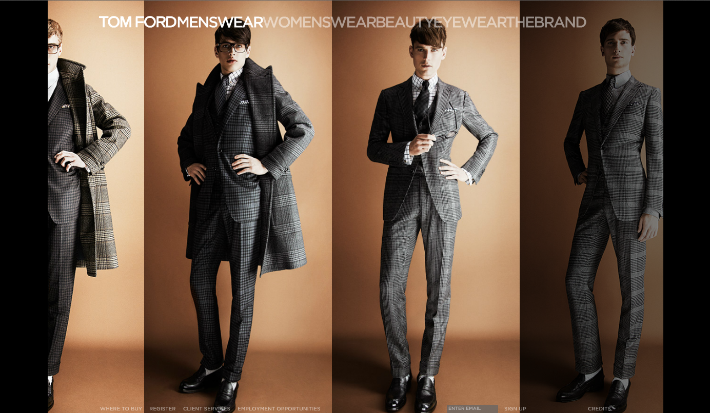
This happens for every for every section that you click on except the ones that hardly have anything on. The bad thing about doing this is that there is hardly any information about the designs, what they are called and how much they are.

In the bottom left hand corner of the page, there is really small writing that says 'Where to buy'. When you click on this, it automatically directs you to a page that gives the choice of shopping online or finding a shop near you that sells the items that you want. Seeing as when you click on 'shop online' it only comes up with eyewear or make-up, I decided to click on the retailers option to see what was on offer. It turns out that when you click on that, you have to select different boxes before you are given an address for a shop in your area.
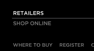


I would say that this is the weakest part of the whole website. People do not expect to go onto a fashion website and not be able to shop online properly. The fact that there is no information about anything that is on the website is very disappointing and I'm pretty sure that there's no update or else it would say it somewhere on it.
Even though this website lacks information, the layout, colours and use of images and the way they have been used is great. I think that it is a very modern and very beautiful website, which which works as a selling point for the products and designs of Tom Ford. Like I said in my 'What makes a good website?' post, " If a website doesn't look appealing, the audience is most likely not going to type it into their address bar." which is not the case here.
-Rebecca Hickey
No comments:
Post a Comment