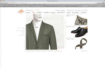
Here is the homepage for Hermès.
I think that the homepage for this website is really good, the colours work well with each other and it has been laid out really well. The only thing that I would say that could be changed is the blank space around it. I feel that the contents on this page should be enlarged so it replaces all the white space.
However, this is quite a good technique to use as everything that you need to look at is right in front of you and you don't really need to look far for it. I guess that it just depends on the viewer really and what they prefer.
Another thing that I like about this homepage is the font that is used and the original images, they give the website a homely feeling and I automatically felt like I'd be able to find anything on the website which takes away the fact that there is a lot of white used.
When I clicked onto the different sections that are listed at the top of the website, I noticed that when I clicked onto the different pages, they were kind of exactly the same.
There wasn't really anything different on them, (except from the words and images of course) the layout on each page was the same and there was still that blank outline. (Which is kind of annoying.)
Now, my personal opinion is that it gives the website a weak point, but it could be argued that it's also a strong quality as it gives the viewer everything that they need (again) right in front of them.
The thing that I noticed that was really clever is how the website shows the different types of clothing that can be bought. Instead of just having a photo gallery, which shows everything off, the viewer can choose how they want to see the piece of clothing. So, for example, you're a woman and you want to view one of the scarfs that is available. You pick the one you like and it automatically opens up with a sketch of what it would look like if you wore it in the recommended way, in the corner there is an option to open it up and see what it looks like when you don't do anything with it.
I think that this is a really strong point to the website as it gives the viewer that kind of interaction that they get when they shop for a scarf in real life.
Overall, I think that http://uk.hermes.com/?combination=1 is a really good website. It's clean, simple and is perfect for the target audience that it's aimed at. It is very original because of how it uses sketch work to replace mannequins or models that would show off the designs and clothing styles, because of this, I have named it one of my three good fashion websites.
-Rebecca Hickey


.png)

No comments:
Post a Comment